Museum Map Redesign
Improving wayfinding and readability through information architecture and visual design

Overview
A museum map helps visitors navigate an unfamiliar building, find galleries and amenities, and understand how different spaces connect. Because it is often used while walking through the museum, information needs to be easy to find and read at a glance.
As a gallery attendant at the New Orleans Museum of Art, I regularly see visitors use the museum's map. Staff have also raised concerns about its layout and readability, making it an opportunity to improve an important part of the visitor experience.
I decided to redesign the map as a self-initiated UX project, focusing on information hierarchy, wayfinding, legibility, and physical usability
Role - UX / Information Designer
Tools - Figma, [other tools]
Duration - 2 weeks
Deliverable - Printable map + Figma prototype
Type - Self-initiated project
The Problem
The existing map contains the information guests need, but its organization and visual presentation make that information difficult to navigate. The challenge was to improve the map’s usability without changing the museum’s physical layout or removing important information.
The goal was to create a map that guests could understand quickly and use confidently while moving through the museum.
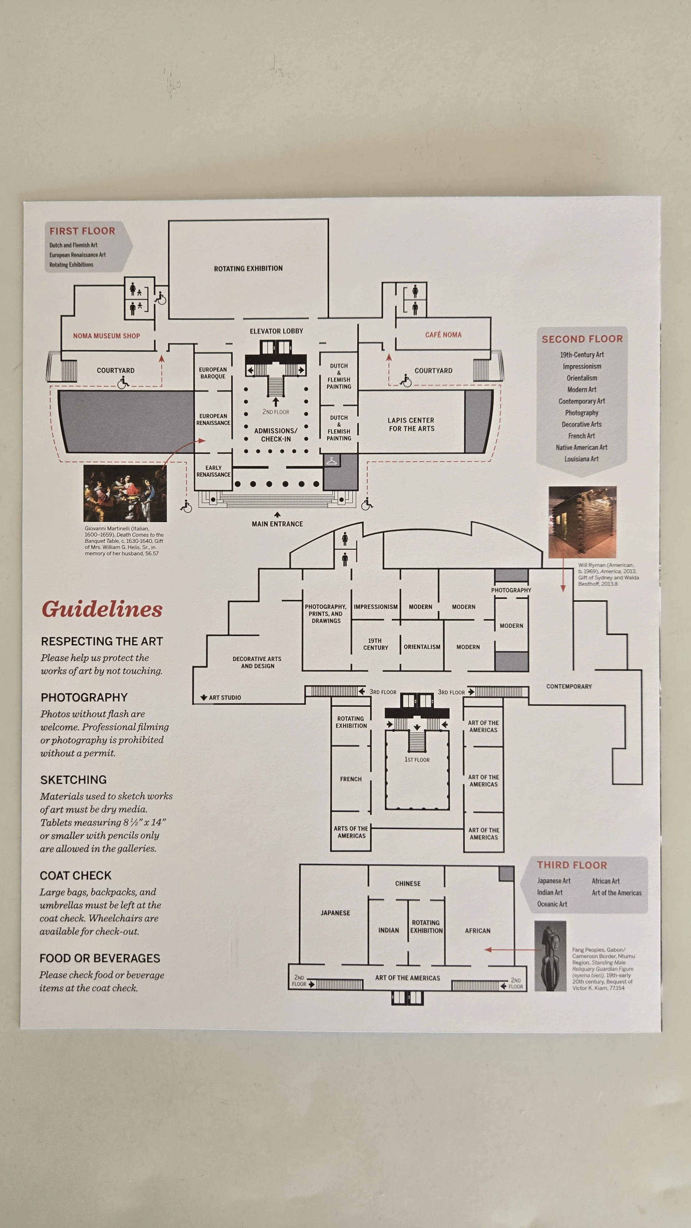
Pain Points
I focused on identifying the main pain points visitors experience when using the existing map. Through observations on the gallery floor and conversations with gallery attendants as well as visitors, I looked for recurring moments of confusion, difficulty locating destinations, and uncertainty about where to go next. Interestingly most of the issues were centered around the location of the amenities than the art, all of which are on the 1st floor.
Based on the museum map, the pain points were often:
Difficulty finding specific galleries or destinations
Identifying where the restrooms where
Lack of easy to spot visuals that identifies where accessibility options are
[annotated version]
Reorganization & Testing
I used these pain points to rethink how the existing information was organized on the page, with a focus on improving readability and making key information easier to find.
I began with sketch explorations to generate different approaches to the layout, then moved into wireframes to test the organization and readability of the information. From there, I developed the strongest direction in Figma, refining the typography, symbols, spacing, and overall composition with the physical map in mind. The final prototype represents the completed direction and how the reorganized information would work as a printed map.
I tested the redesigned layout with my coworkers by printing it out on a sheet regular printing paper and asking them to complete common wayfinding tasks using the prototype. I observed what they looked for first, where they hesitated, and whether they could locate information without additional explanation. Their feedback informed the final adjustments to the layout and information hierarchy.
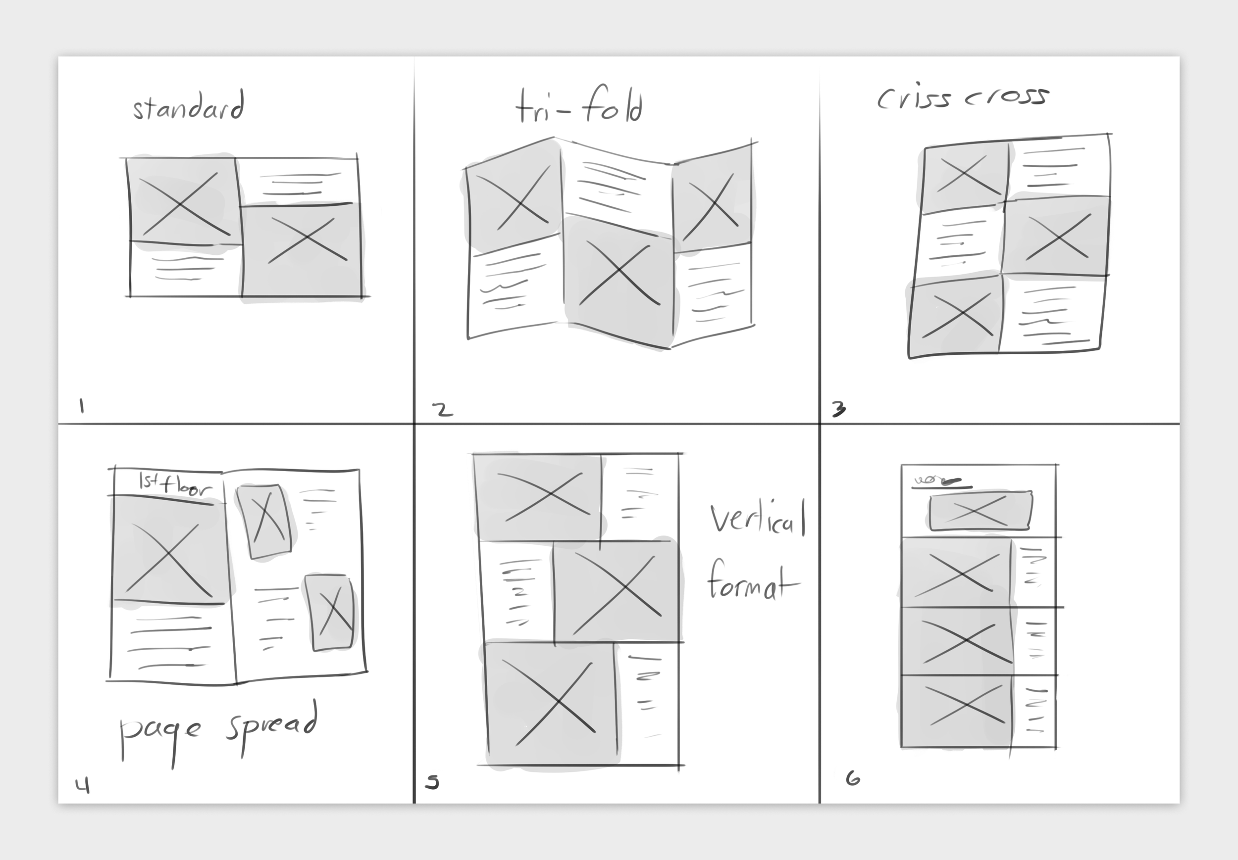
Sketch explorations
Outcome
The completed redesign resulted in a clearer and more cohesive museum map that can be used as both a digital prototype and a physical printed resource. The project also provided a foundation for continued refinement based on feedback from staff and visitors.
Next Steps
If implemented, the map could be tested further with a larger group of visitors and refined based on real-world use in the museum.